How to Build a Genogram: A Step-by-Step Guide With Symbols
If you’ve ever tried to explain your family to someone in a single sentence, you know it doesn’t work. “It’s complicated” is usually where that conversation ends. A genogram is what you draw when “it’s complicated” isn’t good enough anymore, whether you’re a therapist mapping a client’s history, a social worker documenting a case, or someone trying to make sense of patterns that keep showing up across generations.
Unlike a family tree, which mostly just tracks who’s related to whom, a genogram shows how people are connected: marriages, divorces, estrangements, close bonds, medical conditions, addiction, and mental illness, all of it. The format was developed by Monica McGoldrick and Randy Gerson in the 1980s, building on Murray Bowen’s family systems theory, and it’s still the standard used in clinical and social work settings today.
This guide walks through building one from scratch, whether you’re sketching it on paper or using a genogram builder to do the heavy lifting.
What You Need Before You Start
Before you touch a canvas or a piece of paper, gather what you can:
- Full names, birth years, and (if relevant) death years for at least three generations
- Marriage, divorce, and separation dates
- Notes on relationship quality: who’s close, who’s estranged, who barely speaks
- Any known medical or mental health history: heart disease, cancer, depression, substance use, and so on
- Cultural, religious, or immigration details if they matter to your purpose
You won’t have all of this up front, and that’s fine. Genograms get built in layers. Most people start with what they know and fill in gaps as they interview family members or, in a clinical setting, as sessions continue.
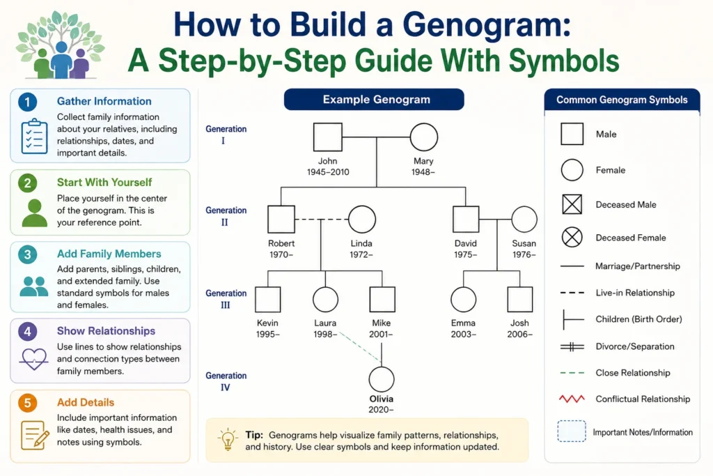
Step 1: Pick Your Index Person
Every genogram centers on one person, called the index person. This is the client, the patient, or you, if you’re mapping your own family. Place their symbol first: a square for male, a circle for female, and a diamond if the gender is unknown or the person is nonbinary. A double-lined shape usually marks the index finger so they’re easy to spot later.
Step 2: Add the Immediate Family
Next comes the core unit. If the index person has a partner, place that symbol to the right and connect the two with a horizontal line to show the relationship. Add children below the couple, oldest on the left and youngest on the right, each connected by a vertical line down to a shared branch.
Keep generations aligned horizontally. Grandparents sit on the top row, parents in the middle, and so on down. This isn’t just tidiness. It’s what lets someone read the chart at a glance instead of hunting for how everyone relates.
Step 3: Work Outward to Extended Family
Once the immediate household is mapped, expand: siblings and their families, then grandparents, then aunts, uncles, and cousins if they’re relevant to whatever you’re documenting. A clinical genogram typically covers three generations minimum. Going wider isn’t wrong, but it can clutter the chart fast, so only add branches that actually serve the purpose of the assessment.
A tip that saves a lot of redrawing: work one side of the family fully before moving to the other. Jumping between maternal and paternal lines mid-draft is where most hand-drawn genograms turn into a mess.
Step 4: Mark Relationship Types
This is where a genogram starts doing more than a family tree ever could. Different line styles show different structural relationships:
- Solid line: marriage
- Dashed line: cohabitation or an unmarried partnership
- Slash through the line: divorce or separation
- Double slash: a more severe or final break
- Dotted line: an informal or unofficial relationship
If someone has had multiple partners, list them left to right in the order the relationships happened, with children branching down from the correct pair.
Step 5: Layer In Emotional Relationships
Structural lines tell you who’s connected to whom. Emotional lines tell you how those connections actually feel, and this is often the most useful part of the whole exercise. Standard notation includes:
- A single line for a normal relationship
- A double line for a close bond
- A triple line for an enmeshed or fused relationship
- A jagged line for conflict
- A dashed line with a break for cutoff or estrangement
These overlays are drawn directly between the two people involved, separate from the structural lines connecting them by marriage or birth. It can look busy at first, but this is usually the layer that reveals the pattern you were looking for in the first place, like a family where every generation has one relationship marked by conflict, or one where cutoffs repeat every few decades.
Step 6: Add Medical and Social History
If the genogram is being used clinically, this step matters as much as the structure itself. Inside or next to each person’s symbol, note relevant health conditions using shading, symbols, or a small legend: diabetes, heart disease, cancer, depression, anxiety, substance use disorder, and so on. Some practitioners use quadrant shading inside each shape so multiple conditions can be tracked per person without cluttering the page.
This is also where you’d note things like immigration history, major relocations, religious affiliation, or cultural background if they’re relevant to the assessment.
A word on sensitivity here: genograms often hold information people haven’t said out loud in years. If you’re building one with a client or family member, let them set the pace. Ask open questions, don’t push for details they’re not ready to share, and be clear up front about who will see the finished chart.
Step 7: Review, Clean Up, and Save
Once everything’s in place, step back and check it. Are generations still aligned? Does every line connect to the right person? Is anything mislabeled? This is also the point where a genogram builder earns its keep. Auto-layout tools can straighten a chart that’s drifted out of alignment after a dozen edits, and most let you export as a PDF, PNG, or image file for records or presentations.
Save a version you can come back to. Genograms aren’t usually a one-time document. In ongoing therapy or casework, they get revisited and updated as new information comes in.
Common Mistakes to Avoid
A few things trip people up consistently:
Skipping the emotional layer entirely. A genogram with only structural lines (who married whom, who’s whose kid) is really just a fancy family tree. The emotional and health overlays are where the clinical value lives.
Losing generational alignment. If grandparents, parents, and children aren’t lined up on consistent horizontal rows, the chart becomes hard to read fast, even if every individual connection is correct.
Overloading one chart. Trying to capture five generations, every cousin, and every medical detail on a single page usually makes it unreadable. Some tools let you switch between a “health view” and a “relationship view” of the same data instead of cramming everything into one image.
Guessing at symbols. There’s a standardized notation for a reason. If you invent your own shorthand, the chart stops being useful to anyone but you.
Paper vs. a Genogram Builder
You can absolutely draw a genogram by hand, and plenty of clinicians still sketch a rough one during a first session. But once a family gets past two generations or a handful of siblings, hand-drawn charts get messy quickly, especially with remarriages, half-siblings, or multiple divorces to track.
A genogram builder handles the notation for you: correct symbols, properly connected lines, and generations that stay aligned automatically as you add people. Most also let you export finished charts, save versions over time, and, in clinical settings, keep client data encrypted and stored securely. For anyone building genograms regularly rather than once, that’s the difference between a five-minute task and a twenty-minute one.
FAQ: Genogram Builder Questions
What’s the difference between a genogram and a family tree? A family tree shows biological and legal relationships. A genogram adds emotional quality, medical history, and behavioral patterns on top of that structure, which is why it’s used clinically and a family tree generally isn’t.
How many generations should a genogram include? Three is the standard minimum for clinical use: grandparents, parents, and the index person’s generation. More is fine if it serves the purpose, but it can make the chart harder to read.
Do I need special training to build one? No. The symbols and rules are standardized and learnable in an afternoon. Clinical interpretation of the patterns takes more experience, but the drawing itself doesn’t require any.
Can I make a genogram for my own family, not for therapy? Yes. Plenty of people build genograms purely to understand their own family patterns, medical history, or history of relationships, no clinical setting required.
What symbol is used for someone who has died? An X is drawn through their shape (square or circle), usually with birth and death years noted beside it.
Is a genogram builder better than drawing by hand? For a one-off, simple chart, hand-drawing is fine. For anything with remarriages, multiple generations, or ongoing updates, a builder saves time and keeps the notation consistent.
Building Yours
Start with what you actually know: yourself, your parents, and and your siblings. Add the relationship lines, then the emotional layer, then whatever medical or social history is relevant to why you’re building it in the first place. The chart doesn’t need to be complete on day one. It just needs to be accurate as far as it goes and easy to keep adding to as you learn more.